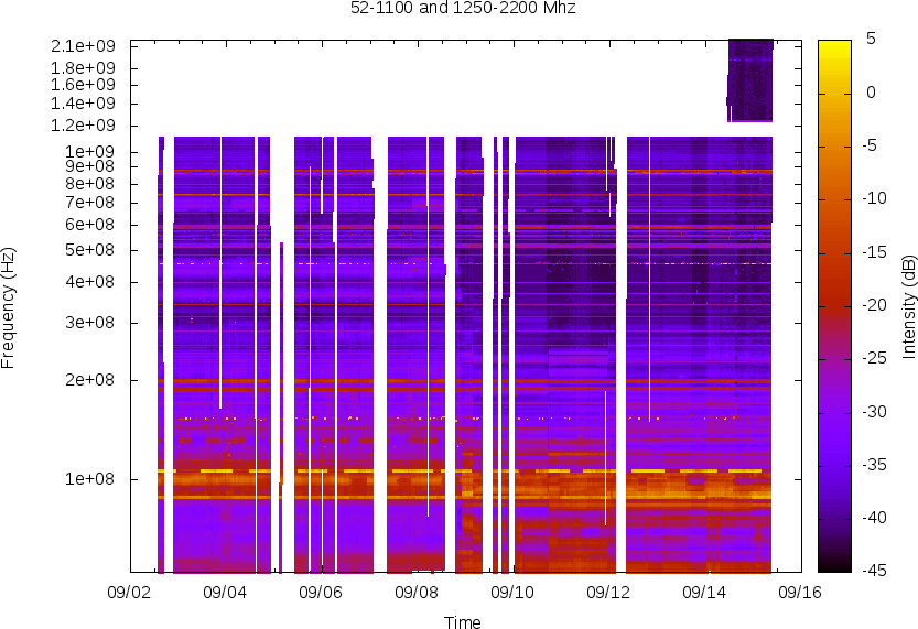
I've got a lot of radio intensity data. I'm trying to make sparse (in time) spectrograms of it. Try 1 failed. Try 2 was closer but still confused. Try three with real data was close enough.
I am having a terrible time trying to graph some simple 3 dimensional data. I want the horizontal rows (y-axis) to be for frequency. And on each of those rows I want scatterplots of the value pair frequency(time,power) where the interval between power samples is random. I've been told to use dgrid3d, but I'm having some issues with the below config. Basically, even with only 4 frequencies given for the y value, 10 y value rows are shown.
set xdata time
set timefmt "%s"
set ytics 1200000
unset key
set dgrid3d
set hidden3d
set pm3d map
set xrange [1300000000.5-946684800:1300004006.1-946684800]
# splot "combinedlog.txt" using 2:1:3
splot "combinedlog.txt" using 2:1:3 with points ps 3 pt 5 palette
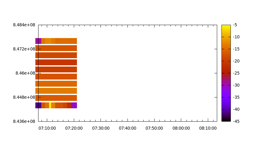
Here's the "combinedlog.txt" test sample. I put some entries out of order in time, and made the timescale longer than necessary intentionally. Note that there are only 4 frequencies actually present in column 1. So there should be only 4 rows on the plot... but instead I get 10.
844400000	1300000802.1	-30.78
844400000	1300000402.1	-1.78
844400000	1300000000.5	-41.51
845200000	1300000002.1	-17.28
846400000	1300000003.9	-25.28
847600000	1300000006.3	-31.28
844400000	1300000102.2	-15.78
845200000	1300000104.7	-18.33
846400000	1300000105.9	-25.2
847600000	1300000108.3	-11.25
844400000	1300000202.1	-13.78
845200000	1300000204.6	10.33
846400000	1300000205.3	-30.56
847600000	1300000207.7	-10.25
844400000	1300000302.1	13.78
845200000	1300000304.6	-12.33
846400000	1300000305.3	-30.56
847600000	1300000307.7	-10.25
844400000	1300000401.1	-40.78
845200000	1300000403.4	-22.33
846400000	1300000404.6	-1.56
847600000	1300000406.1	-16.25
Since what I was doing didn't work I complained on IRC. kauwlna on ##rtlsdr suggested I read the above page. It looked good, so I'll give it a try.
set timefmt "%s"
set view map
set pm3d map
set hidden3d
set terminal png crop
set output 'spectral-map.png'
set term png size 1000, 600
set key off
set title "52-1100 Mhz Spectrogram"
splot '/home/superkuh/www/gnuradio/live/all.log' using 1:2:3  with points  ps 3 pt 5 palette
set xlabel 'Time'
set ylabel 'Frequency'
set cblabel 'Intensity'
set cbrange [0 to GPVAL_DATA_Z_MAX]
set xrange [GPVAL_DATA_X_MIN to GPVAL_DATA_X_MAX]
set yrange [GPVAL_DATA_Y_MIN to GPVAL_DATA_Y_MAX]
set ytics 1200000
replot
#splot 'combinedlogs2.txt' using 1:2:3  with points  ps 3 pt 5 palette
The output looks rough but acceptable.
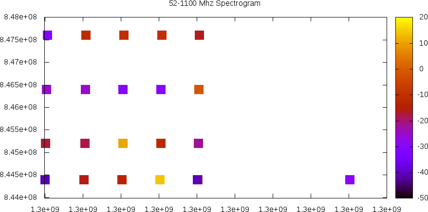
An altered combinedlogs2.txt with the unixtime and frequency reversed.
1300000802.1 	844400000	-30.78
1300000402.1	844400000	-1.78
1300000000.5	844400000	-41.51
1300000002.1	845200000	-17.28
1300000003.9	846400000	-25.28
1300000006.3	847600000	-31.28
1300000102.2	844400000	-15.78
1300000104.7	845200000	-18.33
1300000105.9	846400000	-25.2
1300000108.3	847600000	-11.25
1300000202.1	844400000	-13.78
1300000204.6	845200000	10.33
1300000205.3	846400000	-30.56
1300000207.7	847600000	-10.25
1300000302.1	844400000	13.78
1300000304.6	845200000	-12.33
1300000305.3	846400000	-30.56
1300000307.7	847600000	-10.25
1300000401.1	844400000	-40.78
1300000403.4	845200000	-22.33
1300000404.6	846400000	-1.56
1300000406.1	847600000	-16.25
Here I slowly figured out what the syntax I had been blinding copying, pasting, and moving around actually did to produce a real graph.
set timefmt "%s"
set view map
set terminal png crop
set output '/home/superkuh/www/spectral-map2.png'
set term png size 900, 600
set key off
set title "52-1100 Mhz"
set xlabel 'Time'
set ylabel 'Frequency'
set cblabel 'Intensity'
set xdata time
set format x "%m/%d"
set ytics 100000000
plot '/home/superkuh/www/gnuradio/live/all.log' using 1:2:3 with points ps 0.18 pt 5 palette
exit
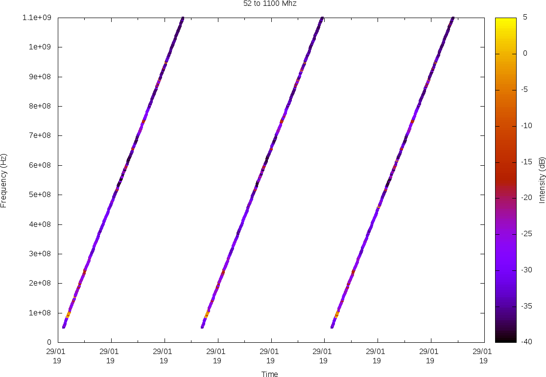
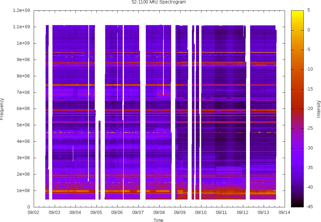
But then I started monitoring an extra 1Ghz of bandwidth which was kind of boring most of the time. To preserve the detail in the lower frequences I decided I wanted to plot on a log scale.
set logscale y
# can't set ytics over 2200000000 because of integer overflow
set ytics (100000000,200000000,300000000,400000000,500000000,600000000,700000000,800000000,900000000,1000000000,1200000000,1400000000,1600000000,1800000000,2100000000)
